
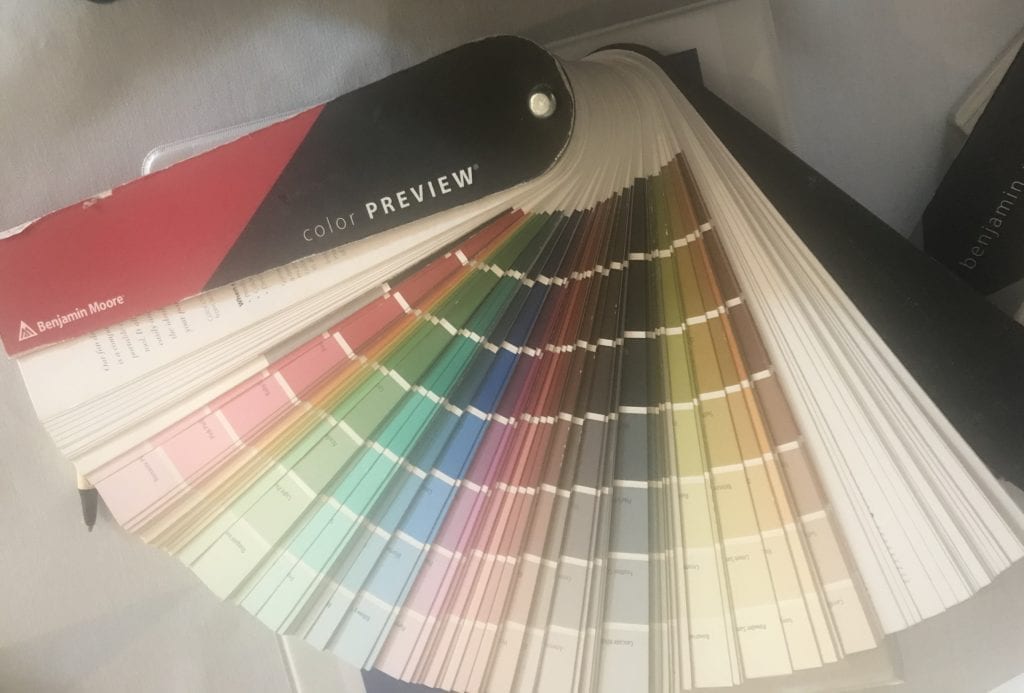
The good news is that there are seemingly endless options when it comes to paint colors. The not so good news is that this number of options can be completely overwhelming! Popular paint distributor Benjamin Moore has over 3500 color selections available to you and Sherwin Williams has over 1500.
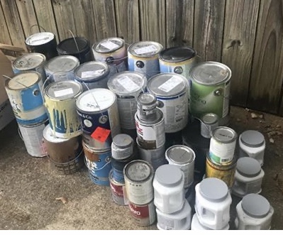
Is your basement full of paint cans from trying sample after sample? Often we choose a color we like and try to make it work in our space. While you can select a general color palette that you want to use, there are some other elements you need to consider. Let me share some guidelines with you to help you make the perfect pick!
DETERMINE THE UNDERTONES OF YOUR FIXED ELEMENTS
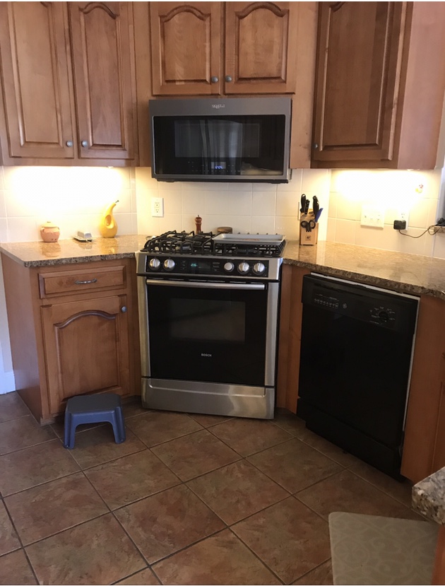
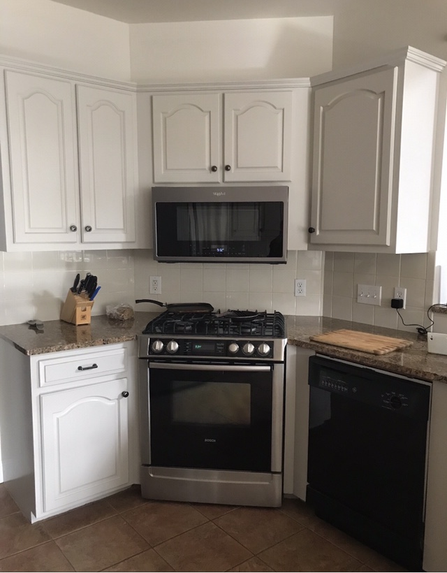
Whether you are working with a new build or in your existing home, your starting place for color should be your hard finishes. Typically I recommend you begin by selecting your flooring and countertops. These surfaces will have an undertone of color that will determine the paint colors that will work in your space. An undertone is a color that is present but not always obvious because of lighting or surrounding colors.
Many times we want a new look and need to work with the elements we already have in place. You can definitely update your space by choosing the correct paint color. If you have a warm countertop with orange undertones and choose a cool gray paint because that’s a trending color, you will likely not be pleased with the result.
Here’s an example of clients that wanted to work with their existing countertop and flooring. They are planning to move in a few years and did not want to invest in changing those finishes but wanted an updated look. By identifying the undertones, I was able to choose a cabinet color that works in their current space and gives it a fresh new look.
WHITE AND “NEUTRAL” COLORS STILL HAVE UNDERTONES
It is often tempting to just choose a white or cream color and think that it will go with everything. There is still the need to identify the undertones- your selection may have hints of pink, yellow, or blue. Probably not what you had in mind!
HOW TO TEST COLORS
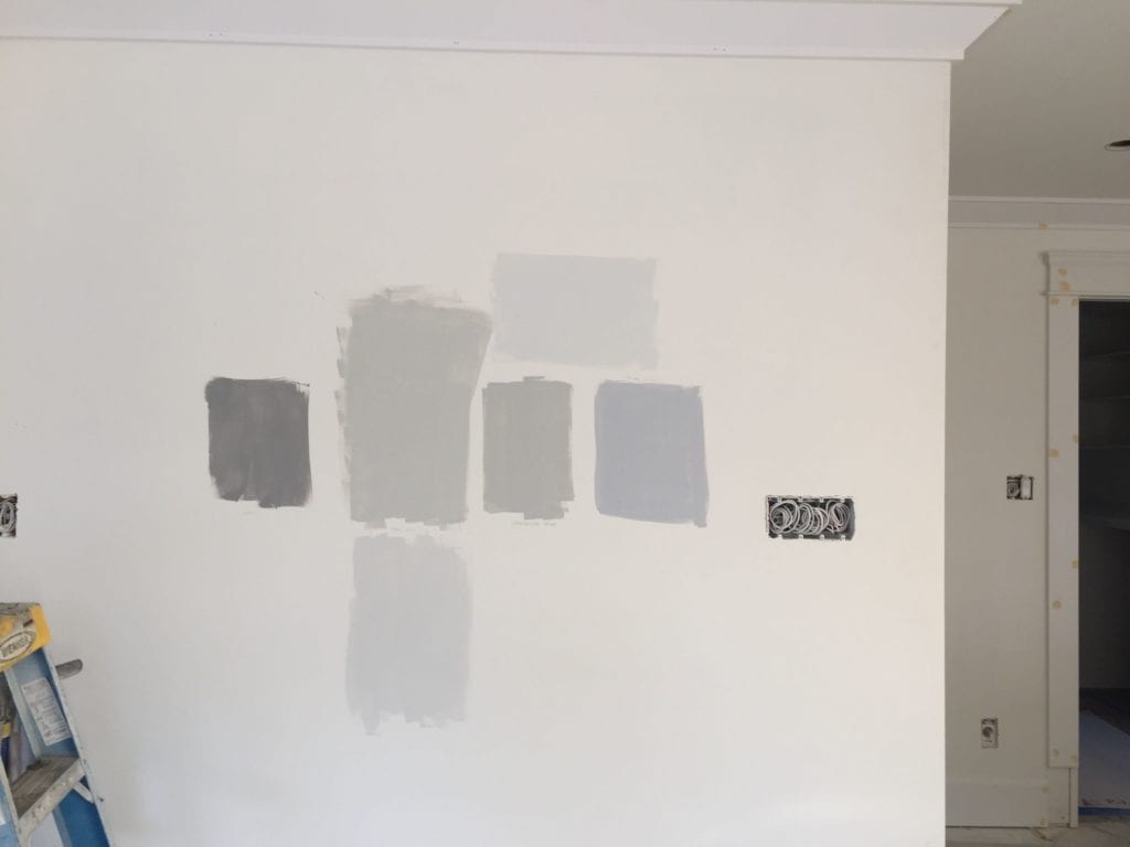
One of the best ways to “see” a color is to compare it to a true white. As tempting as it is to paint your sample directly on the wall, don’t do it! It will not give you a true image of the color because it will be affected by the color already on your walls. Paint your sample on a piece of white poster board leaving a white border around the paint color. Using a board will allow you to move your paint sample around the room and view it in different spots.
CHOOSE THE CORRECT SHEEN
Here are some general guidelines for the different finish choices:
- Flat (Matte): No shine at all. I rarely recommend flat paint for walls as it is very difficult to clean. Flat paint works well for ceilings.
- Eggshell: Has a little bit of shine and is a good choice for moderate traffic areas. Most marks can be wiped off of this surface with a damp cloth. This is the finish I most often recommend for walls.
- Satin: Has a bit more shine and works well in high traffic areas or areas that have moisture. It is also super wipeable which is why it is perfect for kitchens and bathrooms.
- Semi-Gloss: Semi-gloss paint has a lot of shine. It is most often used on cabinets and trim or in really high moisture areas.
- Hi-Gloss Enamel: This gives a very shiny finish and is perfect for high use surfaces (like a railing) or furniture in more formal spaces.
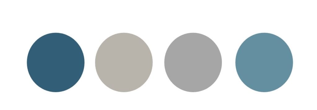
HAVE A COLOR PALETTE FOR YOUR HOME
I don’t mean you have to paint your entire house the same color, but especially in rooms that open into one another consider what each room will look like when standing in another. If you have an open concept space, I would definitely recommend using the same color or varying shades of the same color throughout to create visual flow. If your rooms are more separated, plan to use a palette of colors that work together well.
OTHER THINGS TO THINK ABOUT
Do you prefer for your paint color to serve as a backdrop for your furnishings or do you like to use paint as a dramatic focal point? Depending on your style, you may want to make a bold statement with your design.
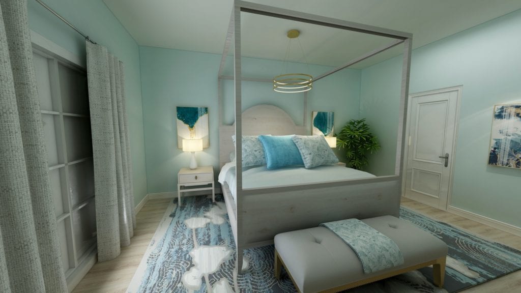
What type of mood do you want to create? The blue green paint color in the bedroom photo above evokes a warm and peaceful feel. Depending on the shade, colors will have a warm or a cool look.
A note about bedrooms: It is helpful to choose your bedding as the jumping off point for your paint color since flooring is usually the only other material in the room that needs to be considered. It’s much easier to find a paint color that works with your bedding than the other way around.
I hope these tips have given you color confidence! If you aren’t sure what the best color is for your space, I would love to help! Set up a free discovery call and let’s chat about your project and discuss setting up a custom color consultation. https://calendly.com/lauragossett
Blessings,
Laura


Be the first to comment