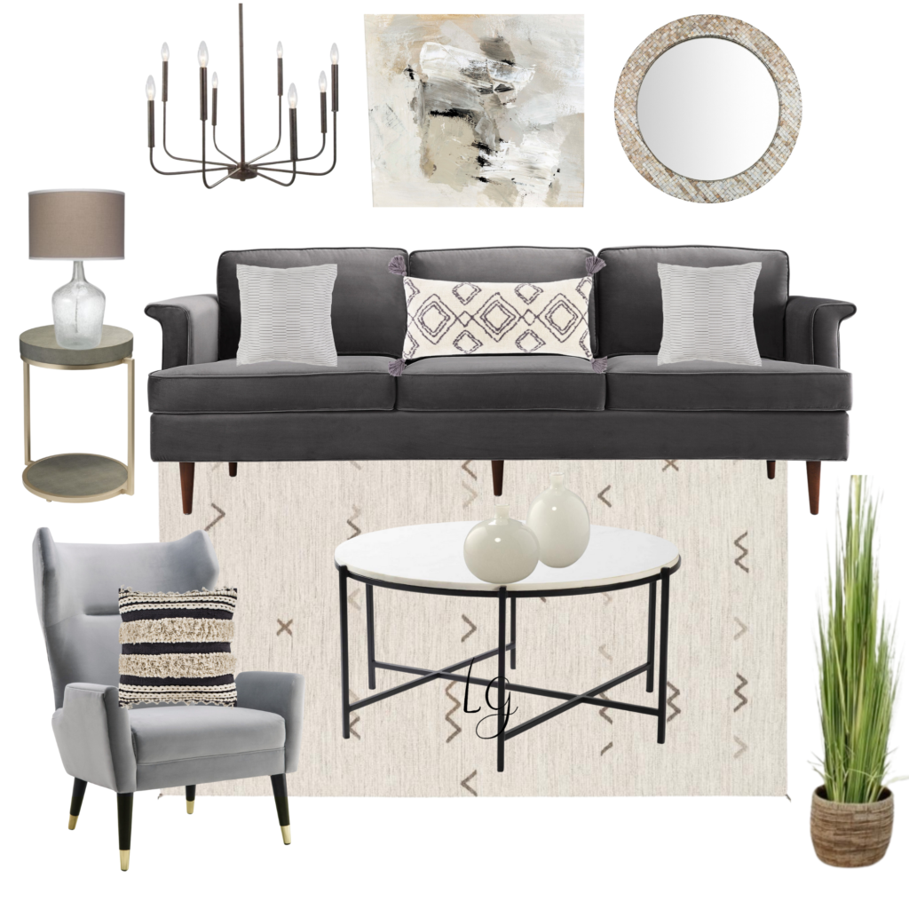
News Flash! Using neutral colors in design does not = boring! In this post I’ll share some tips with you on how to
make your space fun and interesting when using neutral colors. I’ll go over the shoppable design I’ve created and
show you how to pull off this look in your home.
Nice and Neutral
Using neutral colors in design allows so many advantages as you create your new space.
Depending on the decorating plan, the earth tones of gray, white, and beige can be calm and peaceful or lovely and
sophisticated. Selecting neutrals for the main furniture pieces in a design is a smart move! You will likely want to
keep these pieces for a long time so this is a wise investment. You have flexibility in freshening the look of your
space by simply adding a splash of color with pillows and accessories. Seasonal decor can be used without fear of
colors clashing! I’m always moving things around in my home to change things up and having neutral pieces makes
this super easy.
Design Details and Tips
I remember the days in design when the answer to everything seemed to be “paint it black!” Black definitely works
as a neutral but having the right proportion in your color mix is essential. Using black to highlight different design
elements in your space is always classic. In the concept board, there are black accents in the light fixture,
chair and table legs, and in the pillow design. Just the right amount!
The shape and style of each piece makes more of a statement when neutral tones are used. The interesting lines of
the sofa and chair are front and center in this design and might not stand out as much if these pieces were
upholstered in a bold color.
The use of different textures come into play in an important way when using neutrals- the ironwork, fringed and
ribbed pillows, woven planter, stone table top, and mosaic mirror all create interest and dimension in this design.
Different styles can come together under the neutral umbrella. Here I’ve mixed a little bit of modern, a touch of
traditional and a splash of boho.
I love to incorporate natural elements to warm things up when using a color palette that includes gray. I
think gray and beige are fabulous together. It’s all a matter of choosing the tones that complement each other.
The subtle detail on the rug design and the colors in the abstract art piece serve as great inspiration and really pull
this look together.
If you are interested in a custom design plan, book a free discovery call so we can chat about your project!
https://calendly.com/lauragossett
Be the first to comment